A new journaling experience
A new journaling experience
"Every journaling app promised clarity — but ended up feeling like a chore.”
So I stopped building for productivity,
and started designing for peace
"Every journaling app promised clarity — but ended up feeling like a chore.”
So I stopped building for productivity,
and started designing for peace
Problem & insight
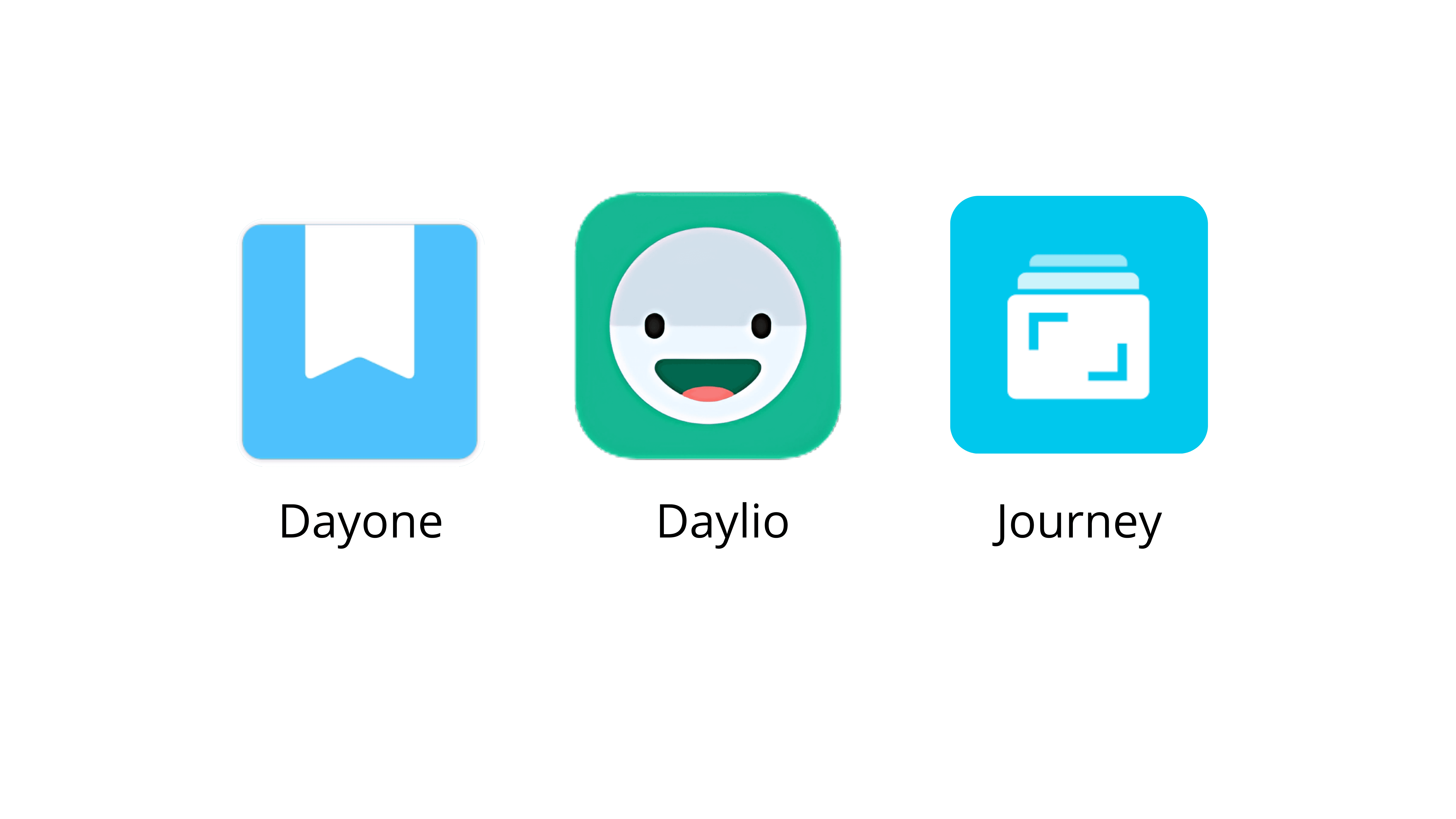
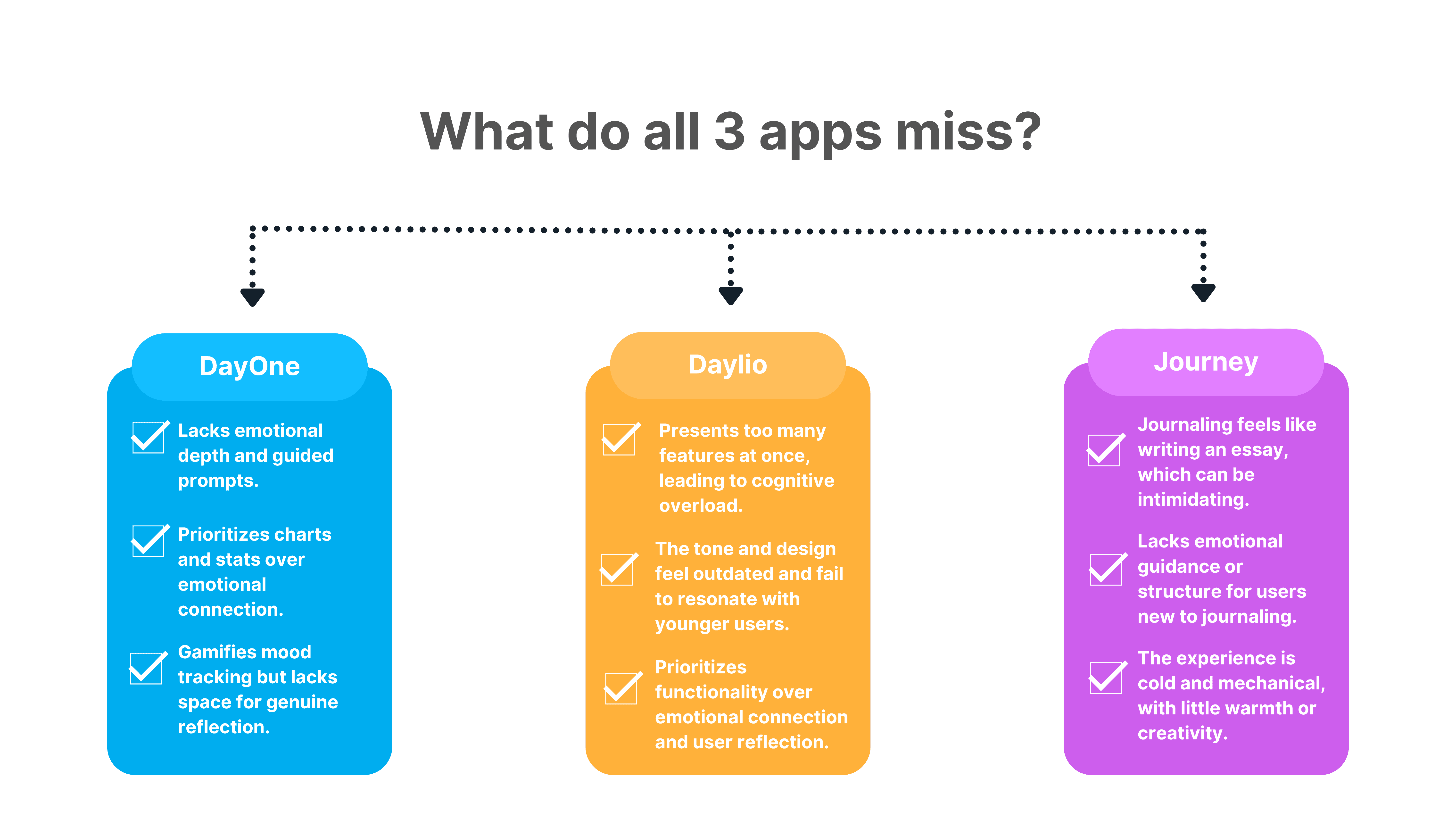
In the age of digital noise and performance-driven self-care, users — especially young adults — struggle to find a journaling platform that supports emotional consistency, feels private, and adapts to their mental well-being needs. Most existing apps are either too clinical (like mood trackers) or overly generic (with repetitive prompts). This creates a gap for users who want a personal, emotionally intelligent, and non-judgmental space to reflect, vent, and grow.
Target audience
College and high school students,
Working professionals(under age 45),
Therapists.
Although the app is designed for both men and women, research indicates that women make up approximately 70% of users of journaling and mental wellness apps.
My Role
Sole UX/UI Designer (User Research + UX + UI)
• Duration: 2 weeks
• Tools: Figma, Notion
• Scope: UX research, wireframing, prototyping, UI design
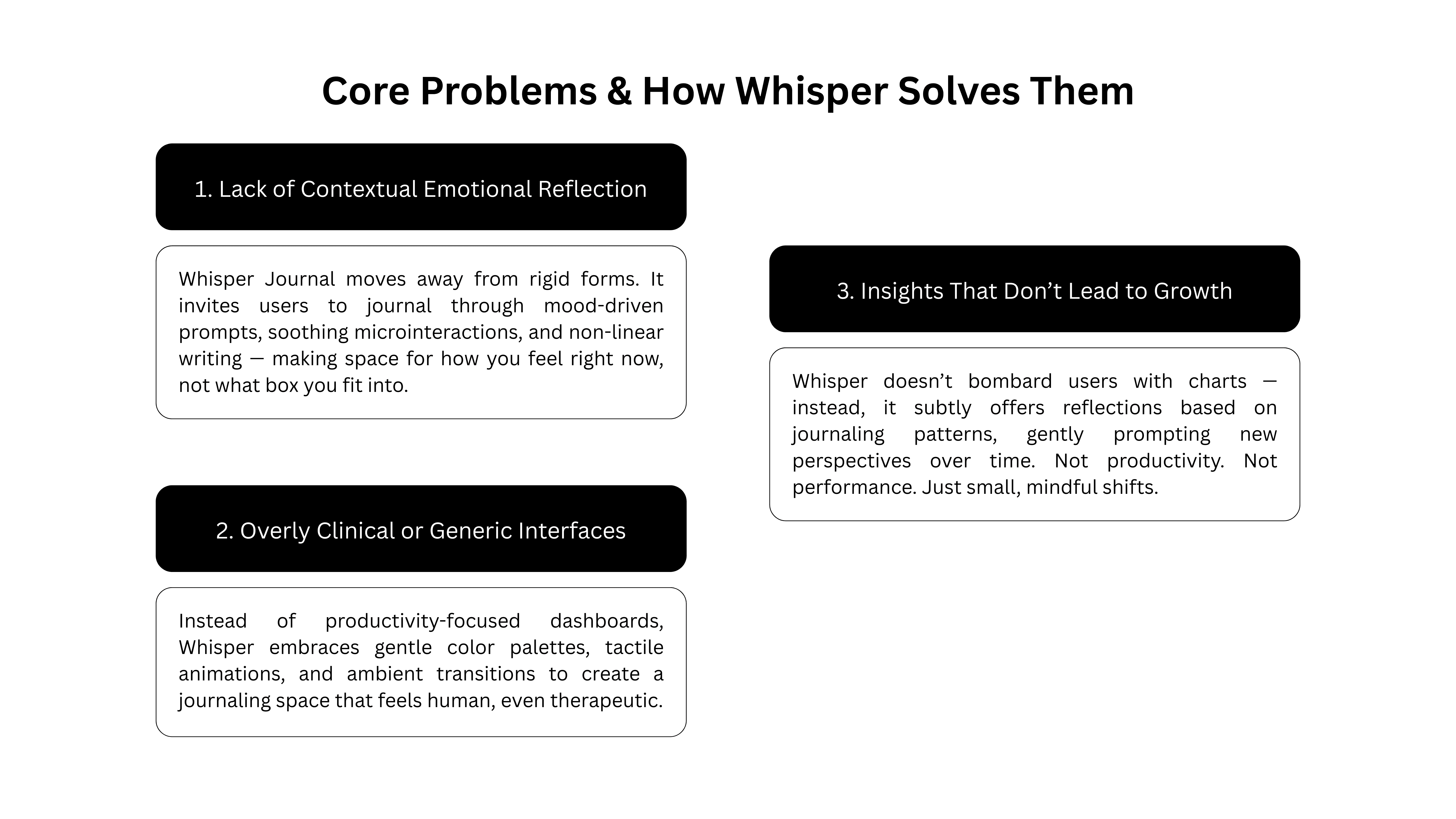
The UX opportunity
I didn’t want to gamify pain.
I wanted to create a soft space where people could reflect without pressure.
Where they could log a feeling with a single tap.
And return not because they “had to,” but because it felt good.
Constraints & Iteration
I worked under a 2-week timeline with no access to direct user interviews. To simulate feedback, I tested flows with 5 friends who had burnout or anxiety. Key changes made:
Rewrote onboarding text after users skipped messages
Removed unnecessary buttons on home screen
Shifted from prompt-style inputs to voice-first CTA
1.ONBOARDING
Onboarding focuses on emotional safety — starting with calming messages, no sign-up friction, and clear assurance of privacy. I reduced cognitive load by limiting questions to only those essential for tailoring the experience.
Onboarding focuses on emotional safety — starting with calming messages, no sign-up friction, and clear assurance of privacy. I reduced cognitive load by limiting questions to only those essential for tailoring the experience.
2.QUESTIONS
Reframed typical prompts into emotionally intelligent, casual questions — like 'What’s on your mind today?' instead of 'Write your thoughts'. This removed formality and helped users open up faster.
Reframed typical prompts into emotionally intelligent, casual questions — like 'What’s on your mind today?' instead of 'Write your thoughts'. This removed formality and helped users open up faster.
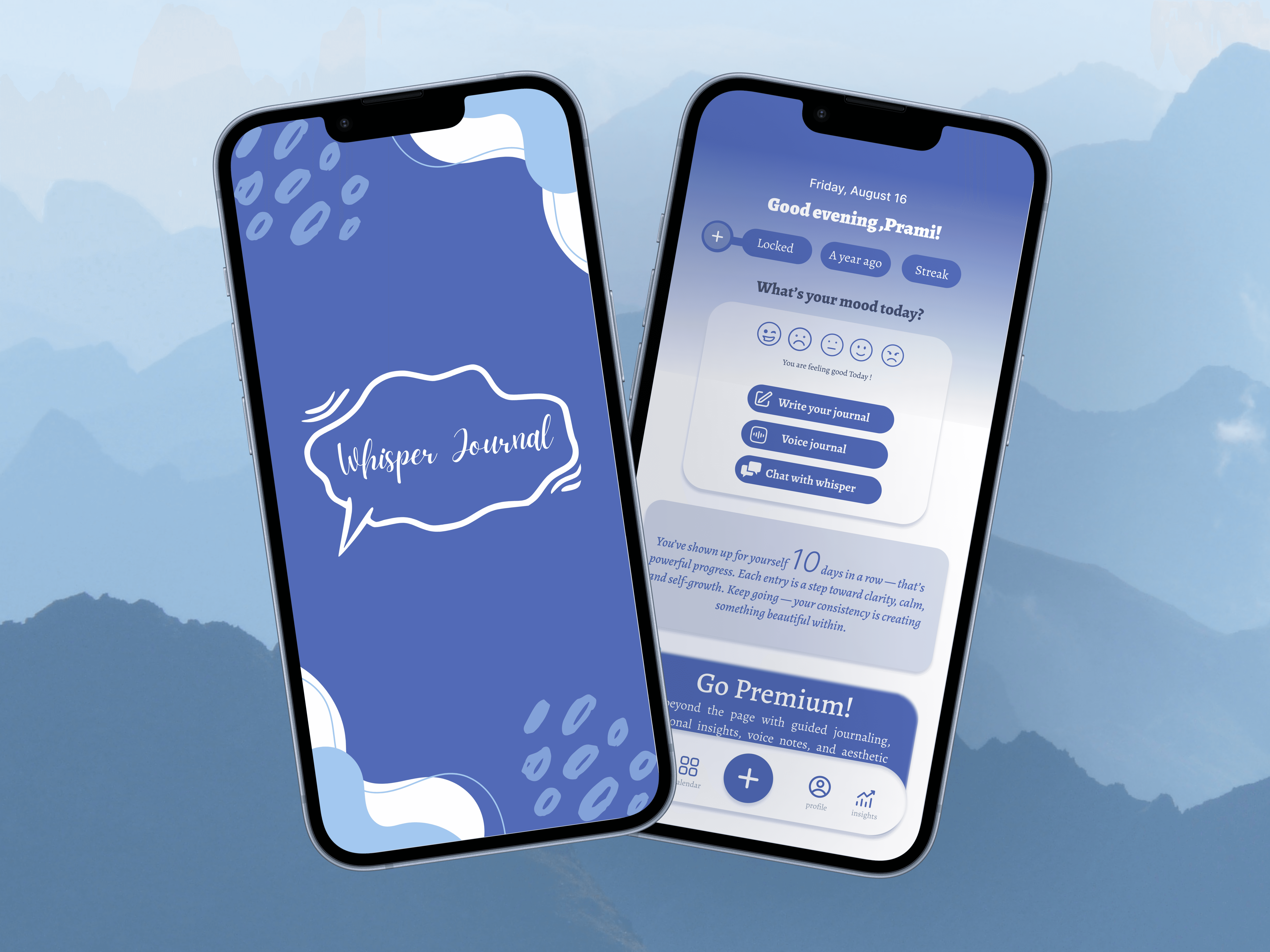
3. JOURNAL HOME
Simplified the home interface to only core modes — Write, Talk, and Chat. Designed with muted tones and spacious layout to create a sense of calm. Prioritized ease of access over feature clutter.
Simplified the home interface to only core modes — Write, Talk, and Chat. Designed with muted tones and spacious layout to create a sense of calm. Prioritized ease of access over feature clutter.
Writing, Voice, and Chat Modes
People reflect in different ways — some write, some speak, and some just need a gentle nudge. These three journaling styles were added to meet users where they are, emotionally and cognitively, without forcing a single mode of expression.
Locked Entries
Because privacy builds trust — users can protect sensitive entries with ease.
Calendar View
A gentle glance at journaling consistency — without guilt or pressure.
Mood Insights
Weekly and monthly reflections reveal patterns, not just data.
Streaks That Nudge, Not Push
Light gamification that celebrates progress without the pressure.
Outcome
3 out of 5 users said they would journal more regularly with this flow
Reduced friction to start by 40% (based on time-to-first-entry in test runs)
Users felt the AI “sounded more human and less judgmental” during feedback sessions
One user shared: “This feels like something I’d actually use on hard days — not just a journaling app.”
Ending the case study
Whisper Journal wasn’t built to scale.It was built to soothe.
And in a world screaming for attention,this is the product that whispers.